
Blue Lines Study Art Print
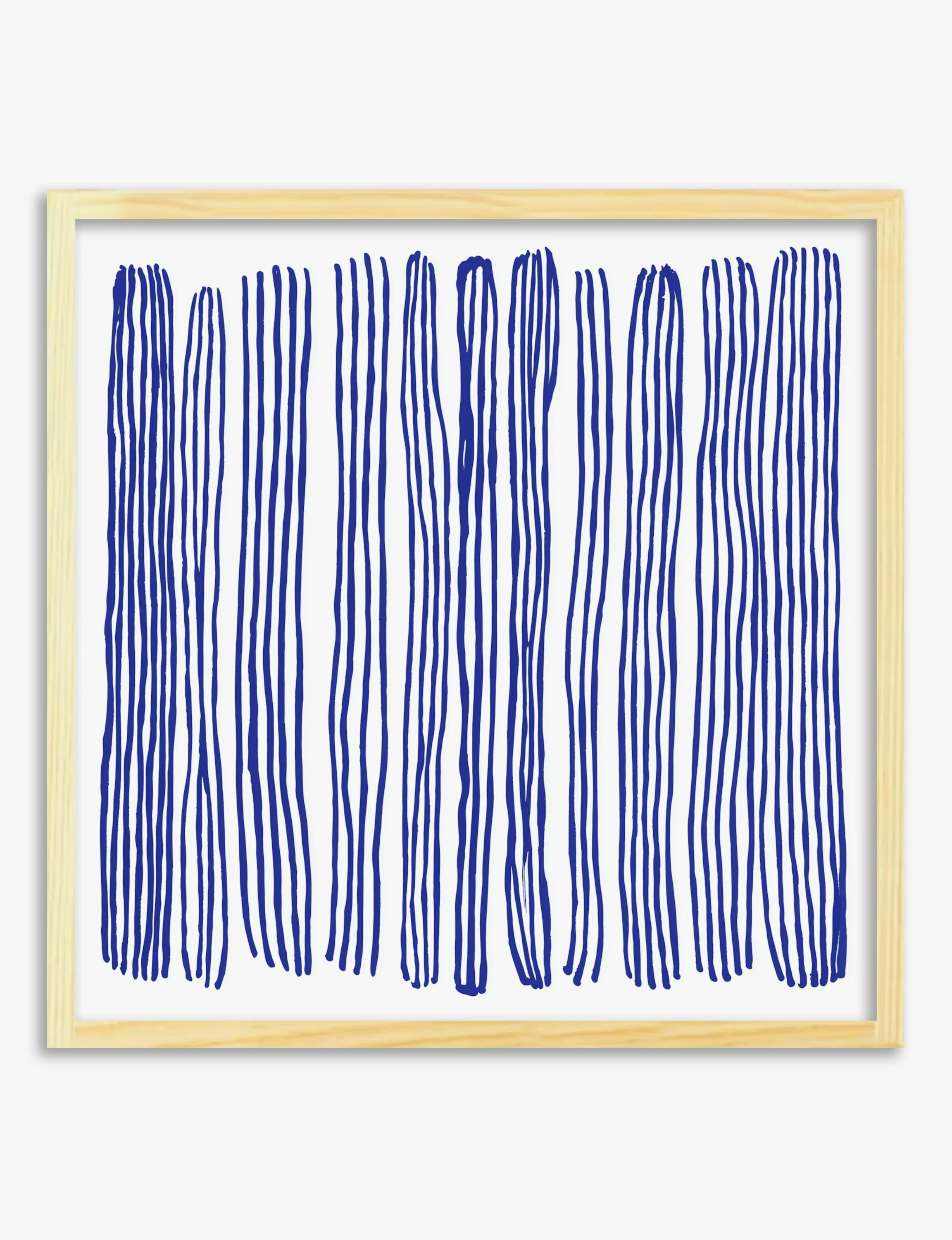
Call it calm if you want; we call it better walls. This is a hand-drawn abstract — deep blue vertical lines on an off-white ground, loose enough to feel made by a person rather than a printer.
Hang it and the room quietens. The off-white reads as breathing space, the blue gives the eye somewhere to settle, and the slightly uneven lines stop it feeling clinical.
It does its best work above a console, a low sideboard, or a writing desk — somewhere a single piece can hold the wall on its own. A square shape suits between two windows or above a bench in a hallway.
Pair it with pale oak, off-white linen, chrome or matte black, and one or two stoneware pieces. Keep the surrounding palette quiet so the blue stays the loudest thing in the room.
Don't crowd it with other busy abstracts — this one wants room to breathe. Framed in oak or black, it reads cleaner still.
Call it calm if you want; we call it better walls. This is a hand-drawn abstract — deep blue vertical lines on an off-white ground, loose enough to feel made by a person rather than a printer.
Hang it and the room quietens. The off-white reads as breathing space, the blue gives the eye somewhere to settle, and the slightly uneven lines stop it feeling clinical.
It does its best work above a console, a low sideboard, or a writing desk — somewhere a single piece can hold the wall on its own. A square shape suits between two windows or above a bench in a hallway.
Pair it with pale oak, off-white linen, chrome or matte black, and one or two stoneware pieces. Keep the surrounding palette quiet so the blue stays the loudest thing in the room.
Don't crowd it with other busy abstracts — this one wants room to breathe. Framed in oak or black, it reads cleaner still.
Original: $29.95
-65%$29.95
$10.48Description
Call it calm if you want; we call it better walls. This is a hand-drawn abstract — deep blue vertical lines on an off-white ground, loose enough to feel made by a person rather than a printer.
Hang it and the room quietens. The off-white reads as breathing space, the blue gives the eye somewhere to settle, and the slightly uneven lines stop it feeling clinical.
It does its best work above a console, a low sideboard, or a writing desk — somewhere a single piece can hold the wall on its own. A square shape suits between two windows or above a bench in a hallway.
Pair it with pale oak, off-white linen, chrome or matte black, and one or two stoneware pieces. Keep the surrounding palette quiet so the blue stays the loudest thing in the room.
Don't crowd it with other busy abstracts — this one wants room to breathe. Framed in oak or black, it reads cleaner still.