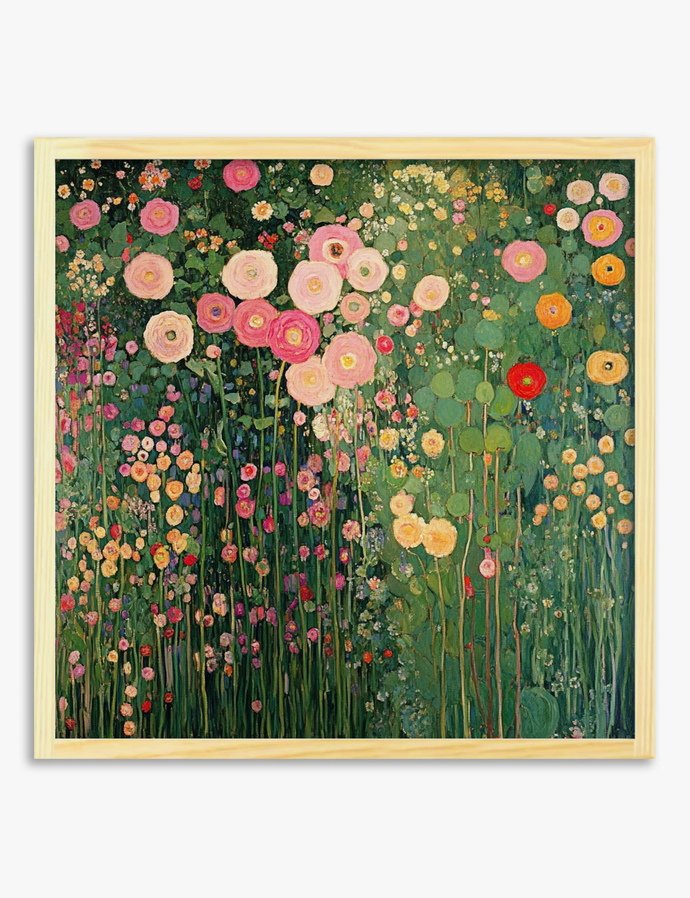

Cowslip Study by Hannah Borger Overbeck Art Print
What it adds isn't clutter. It's loose, vertical tension in the right places. The yellow cowslips lift a quiet wall without shouting, and the sandy background blends into cream, off-white and chalky painted walls. Hang it where you want a soft splash of colour: above a console in a hallway, on a bedroom wall opposite the window, or in a country kitchen between cabinets. Pair it with linen, pale wood, painted furniture and stoneware in warm earth tones. Avoid placing it next to very saturated modern prints or bright primary colours — the soft watercolour washes need room to breathe, and stronger graphic work will flatten them. On premium fine-art paper, the wash edges and pencil marks stay crisp.
What it adds isn't clutter. It's loose, vertical tension in the right places. The yellow cowslips lift a quiet wall without shouting, and the sandy background blends into cream, off-white and chalky painted walls. Hang it where you want a soft splash of colour: above a console in a hallway, on a bedroom wall opposite the window, or in a country kitchen between cabinets. Pair it with linen, pale wood, painted furniture and stoneware in warm earth tones. Avoid placing it next to very saturated modern prints or bright primary colours — the soft watercolour washes need room to breathe, and stronger graphic work will flatten them. On premium fine-art paper, the wash edges and pencil marks stay crisp.
Original: $19.95
-65%$19.95
$6.98Description
What it adds isn't clutter. It's loose, vertical tension in the right places. The yellow cowslips lift a quiet wall without shouting, and the sandy background blends into cream, off-white and chalky painted walls. Hang it where you want a soft splash of colour: above a console in a hallway, on a bedroom wall opposite the window, or in a country kitchen between cabinets. Pair it with linen, pale wood, painted furniture and stoneware in warm earth tones. Avoid placing it next to very saturated modern prints or bright primary colours — the soft watercolour washes need room to breathe, and stronger graphic work will flatten them. On premium fine-art paper, the wash edges and pencil marks stay crisp.