Iris Tapestry in the style of William Morris Art Print
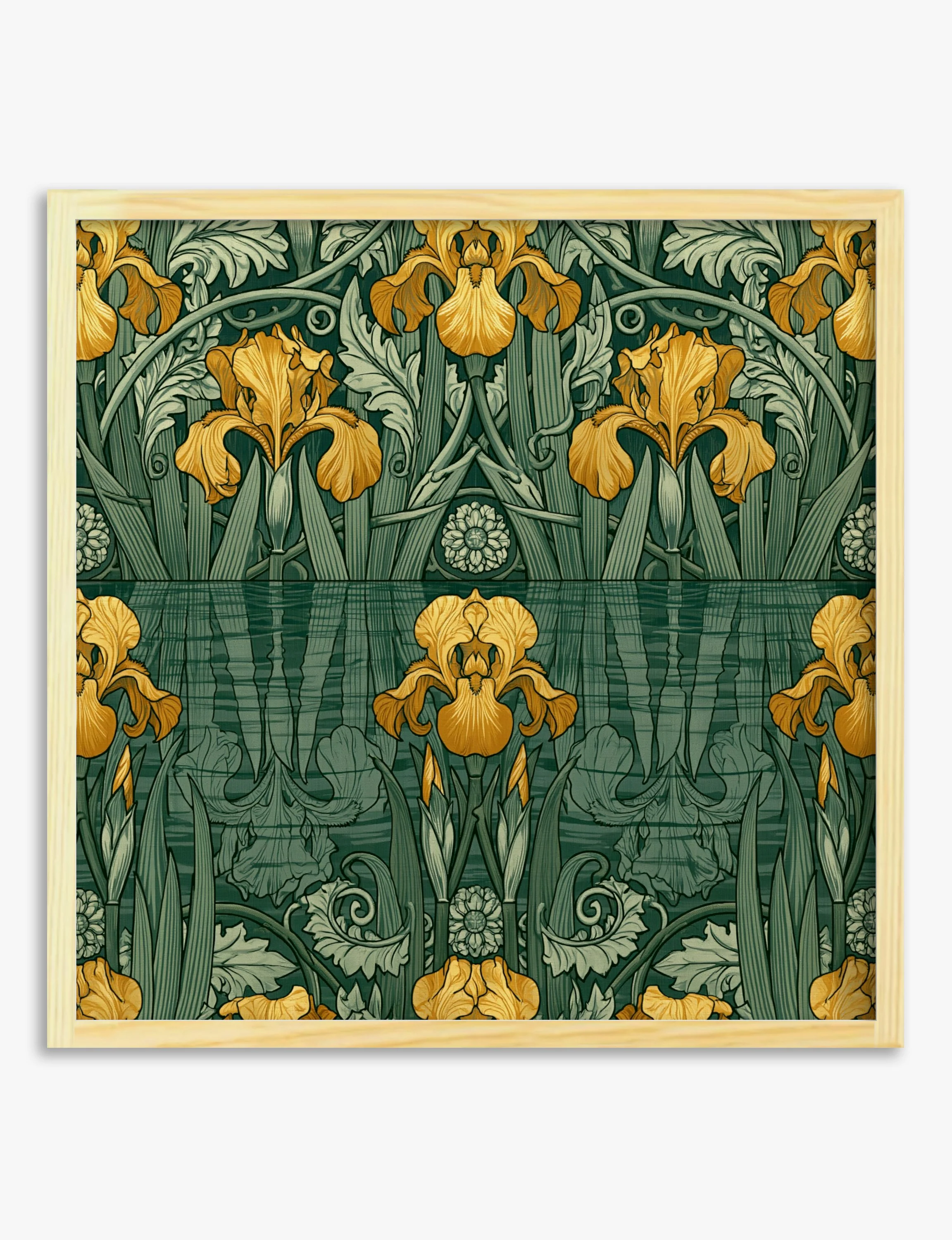
Against oak, the deep green reads less sweet, more deliberate. The iris pattern brings a slow, hand-drawn rhythm to the room without turning it into a period set-piece.
A wall picks up real weight when this goes up. The greens sink back and the gold florals lift forward, so the room gains pattern and depth in one move rather than just colour on a flat surface.
It works best in studies, dining rooms and hallways — anywhere you want a quieter, more grown-up kind of pattern. Hang at eye level over a console or sideboard, or as a feature on a chalky off-white wall.
Pair with oak or walnut, aged brass, linen or velvet, and stoneware in warm earth tones. A dusty pink or cream wall behind it lets the greens breathe.
Don't crowd it with another busy pattern on the same wall. An oak frame keeps the Arts and Crafts feel honest.
Against oak, the deep green reads less sweet, more deliberate. The iris pattern brings a slow, hand-drawn rhythm to the room without turning it into a period set-piece.
A wall picks up real weight when this goes up. The greens sink back and the gold florals lift forward, so the room gains pattern and depth in one move rather than just colour on a flat surface.
It works best in studies, dining rooms and hallways — anywhere you want a quieter, more grown-up kind of pattern. Hang at eye level over a console or sideboard, or as a feature on a chalky off-white wall.
Pair with oak or walnut, aged brass, linen or velvet, and stoneware in warm earth tones. A dusty pink or cream wall behind it lets the greens breathe.
Don't crowd it with another busy pattern on the same wall. An oak frame keeps the Arts and Crafts feel honest.
Original: $29.95
-65%$29.95
$10.48Description
Against oak, the deep green reads less sweet, more deliberate. The iris pattern brings a slow, hand-drawn rhythm to the room without turning it into a period set-piece.
A wall picks up real weight when this goes up. The greens sink back and the gold florals lift forward, so the room gains pattern and depth in one move rather than just colour on a flat surface.
It works best in studies, dining rooms and hallways — anywhere you want a quieter, more grown-up kind of pattern. Hang at eye level over a console or sideboard, or as a feature on a chalky off-white wall.
Pair with oak or walnut, aged brass, linen or velvet, and stoneware in warm earth tones. A dusty pink or cream wall behind it lets the greens breathe.
Don't crowd it with another busy pattern on the same wall. An oak frame keeps the Arts and Crafts feel honest.